Design is not just about what you put on the page—it’s also about what you leave off. White space, often misunderstood as mere emptiness, is a quiet powerhouse in design that breathes life into visuals and enhances user experience. It’s not just a buffer zone but a dynamic element that can sharpen focus, improve comprehension, and evoke emotion. Just like the silence between musical notes, white space lets the important stuff stand out and speaks volumes without saying a word.
But what exactly can white space do for you? Beyond aesthetics, it serves a multitude of functions that elevate design to new heights—whether you’re crafting a website, designing a poster, or creating a mobile app. White space is the unsung hero of design, and embracing it can unlock greater creativity, clarity, and engagement in your work.
The Purpose of White Space
At first glance, white space may seem like a waste of precious real estate, but it actually serves a crucial purpose in guiding the viewer’s eye. By breaking up text, images, and elements, white space prevents visual overload and creates a sense of balance. It’s the art of making things feel simple yet significant.
For example, in web design, effective use of white space helps users navigate effortlessly through content, ensuring they can absorb information without feeling overwhelmed. A cluttered interface causes confusion and frustration, while a well-balanced one, rich with white space, invites users to explore comfortably.
Enhancing Readability and Focus
White space doesn’t just create breathing room—it enhances readability. Text packed tightly together can feel like an impenetrable wall. With the addition of well-spaced paragraphs, margins, and line spacing, reading becomes a more enjoyable and natural experience. It’s like taking a deep breath between thoughts.
In print media, white space surrounding a paragraph or image directs the viewer’s focus to key elements. It functions as a visual guide, emphasizing important points without the need for extra bells and whistles. By isolating key pieces of content, you give them room to shine and resonate.
Evoking Emotional Response
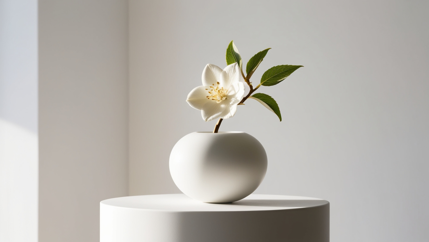
Design isn’t just functional—it’s also emotional. White space can create a mood, whether that’s luxury, calm, or simplicity. Minimalist designs, often associated with sophistication, rely heavily on white space to convey elegance and refinement. Think about high-end brands like Apple, where white space plays a pivotal role in creating a premium feel. It invites users to slow down and appreciate the product or message in front of them.
On the flip side, an overabundance of elements can create stress or confusion. Just like a room filled with clutter, a page overloaded with content leaves no room to breathe. White space allows a design to feel serene, giving the viewer time to process and engage with what matters most.
White Space as a Creative Tool
Far from being a passive background, white space can actively shape the narrative of your design. In advertising, it can be used strategically to draw attention to a single, powerful message. By stripping away distractions, the focus remains squarely on the most important call to action. Less truly becomes more.
In web design, white space ensures that the user’s journey is intuitive and enjoyable. A well-spaced layout helps them move seamlessly from one section to the next, whether they’re reading a blog or purchasing a product. White space offers clarity where there might otherwise be chaos.
Conclusion: Embrace the Space
White space isn’t just empty space; it’s a design tool with limitless potential. It refines and elevates, ensuring that your message is delivered without noise. Like the pause in a conversation or the calm in a storm, white space gives design its power, making your content more digestible, your layouts more engaging, and your brand more memorable.
So next time you’re designing, remember that what you leave out is just as important as what you put in. Embrace the white space—it’s the silent hero your designs have been waiting for.