Most websites fail for a simple reason: they are built for the owner, not for the user.
Designers obsess over colors, animations, frameworks, and trends. Developers focus on performance, structure, and scalability. Business owners think about branding and sales funnels. But there is a missing layer that quietly determines whether a website succeeds or fails:
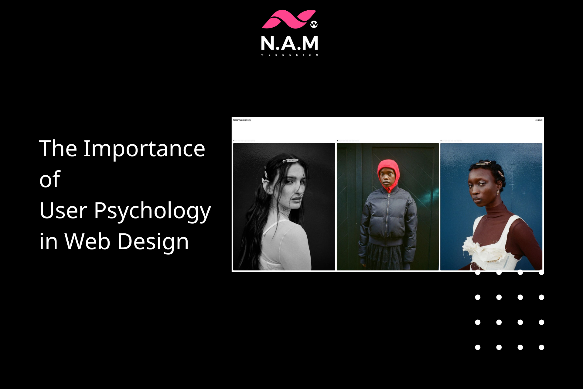
User psychology.
Every click, every scroll, every hesitation comes from a mental process. If you don’t understand how users think, you are effectively designing blind.
A good website is not just visually appealing or technically sound. It aligns with how human brains naturally process information, make decisions, and react to stimuli.
This article breaks down, in practical terms, how user psychology directly impacts web design — and how you can use it to build websites that actually convert.
1. First Impressions Happen in Milliseconds
Users form an opinion about your website in under a second.
This judgment is not rational. It is emotional and automatic. The brain quickly answers:
- “Is this trustworthy?”
- “Is this relevant to me?”
- “Does this look modern or outdated?”
If the answer is negative, users leave before reading anything.
What Drives First Impressions?
- Visual clarity (clean vs cluttered)
- Color harmony
- Typography readability
- Layout structure
- Perceived professionalism
Practical Implication
Do not overload the homepage. Avoid unnecessary elements. Prioritize:
- Clear headline
- Strong visual hierarchy
- Immediate clarity of purpose
Users should not need to “figure out” your website.
2. Cognitive Load: The Silent Killer of Conversion
Human brains prefer simplicity.
When users face too many choices, too much text, or unclear navigation, they experience cognitive overload. This leads to confusion, hesitation, and ultimately abandonment.
Signs of High Cognitive Load
- Too many menu items
- Dense paragraphs
- Multiple competing CTAs (Call-To-Actions)
- Inconsistent design patterns
Psychological Principle
The brain tries to conserve energy. If a website requires effort to understand, users leave.
Practical Solution
- Use short paragraphs
- Limit choices per section
- Apply whitespace generously
- Keep navigation predictable
Good design reduces thinking effort.
3. The Power of Visual Hierarchy
Users don’t read websites line by line. They scan.
Their eyes follow patterns, often in an F-shape or Z-shape.
What Is Visual Hierarchy?
It’s the way elements are arranged to guide attention:
- Headlines first
- Then subheadings
- Then supporting content
- Then actions
Tools to Control Attention
- Font size
- Contrast
- Spacing
- Positioning
Why It Matters
If users don’t know where to look, they disengage.
A strong hierarchy answers:
- What is this page about?
- What should I do next?
Without that, the experience collapses.
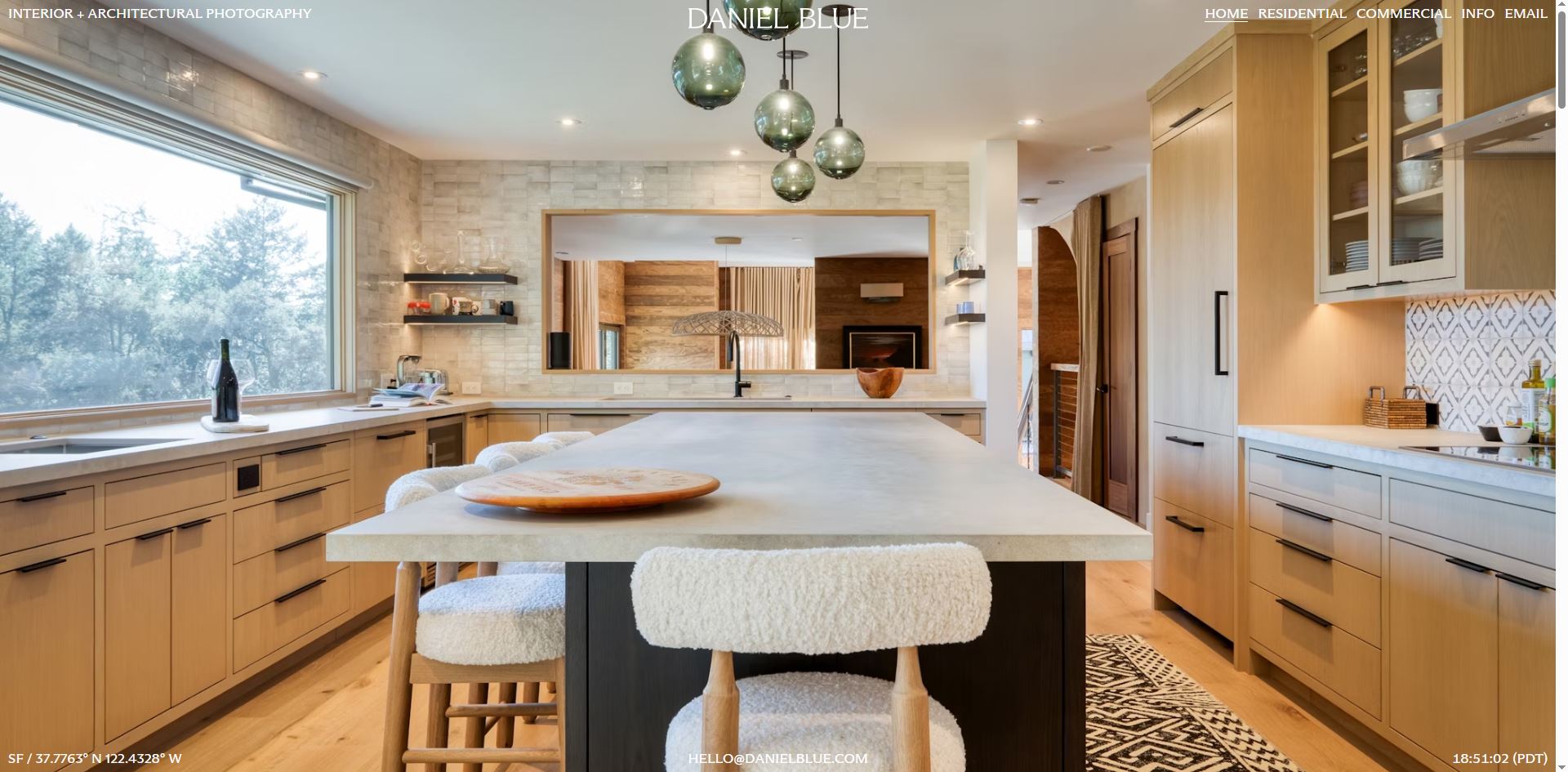
4. Trust Is Built Visually Before It’s Earned Logically
Users don’t verify credibility immediately. They feel it first.
Factors That Influence Trust
- Clean design
- Consistent branding
- High-quality images
- Professional typography
- Fast loading speed
Red Flags That Destroy Trust
- Outdated UI
- Broken layouts
- Too many ads
- Poor mobile experience
Psychological Insight
Humans use heuristics (mental shortcuts). One shortcut is:
“If it looks professional, it probably is.”
Practical Takeaway
Invest in design quality. It directly impacts perceived credibility.
5. Emotional Design Drives Engagement
People don’t just use websites — they experience them.
Emotion plays a central role in decision-making.
Emotional Triggers in Design
- Color (blue = trust, red = urgency, green = safety)
- Imagery (human faces increase connection)
- Microinteractions (hover effects, animations)
- Tone of voice (friendly vs formal)
Example
A sterile, purely functional site may work.
But a site that feels human will outperform it.
Why?
Emotion increases:
- Time on site
- Memory retention
- Conversion likelihood
6. The Role of Familiarity
Users prefer what they already understand.
This is called the “Familiarity Bias”
If your website behaves like other websites they’ve used, users feel comfortable.
Examples
- Logo in the top-left → homepage
- Cart icon in top-right → eCommerce
- Hamburger menu → mobile navigation
Mistake to Avoid
Trying to be “too creative” with navigation or layout.
Innovation that breaks expectations creates friction.
Rule
Be original in content, not in usability.
7. Decision-Making and the Paradox of Choice
More options do not increase conversions. They decrease them.
The Paradox of Choice
When users face too many options, they:
- Delay decisions
- Feel overwhelmed
- Often choose nothing
Application in Web Design
- Limit pricing plans (3 is optimal)
- Highlight one “recommended” option
- Avoid cluttered product listings
Psychological Impact
Clear choices reduce anxiety and increase action.
8. The Importance of Feedback and Responsiveness
Users need confirmation that their actions are recognized.
Examples
- Button changes color when clicked
- Form shows validation messages
- Loading indicators appear
Why It Matters
Without feedback, users feel uncertain:
- “Did I click correctly?”
- “Is this working?”
Result
Uncertainty leads to abandonment.
Fix
Always provide immediate visual or interactive feedback.
9. Speed Is Psychological, Not Just Technical
A slow website feels unreliable.
Even small delays create frustration.
Key Thresholds
- Under 1 second → feels instant
- 1–3 seconds → acceptable
- Over 3 seconds → users start leaving
Psychological Effect
Speed impacts:
- Trust
- Satisfaction
- Perceived quality
Optimization Focus
- Image compression
- Clean code
- Efficient hosting
Performance is part of user psychology.
10. Mobile Behavior Is Different
Mobile users are:
- More impatient
- More task-focused
- More easily distracted
Design Implications
- Larger buttons
- Simpler layouts
- Shorter content blocks
- Sticky navigation
Critical Point
Mobile-first is no longer optional.
It is the default user behavior.
11. Persuasion Principles in Web Design
Several psychological principles directly influence conversion:
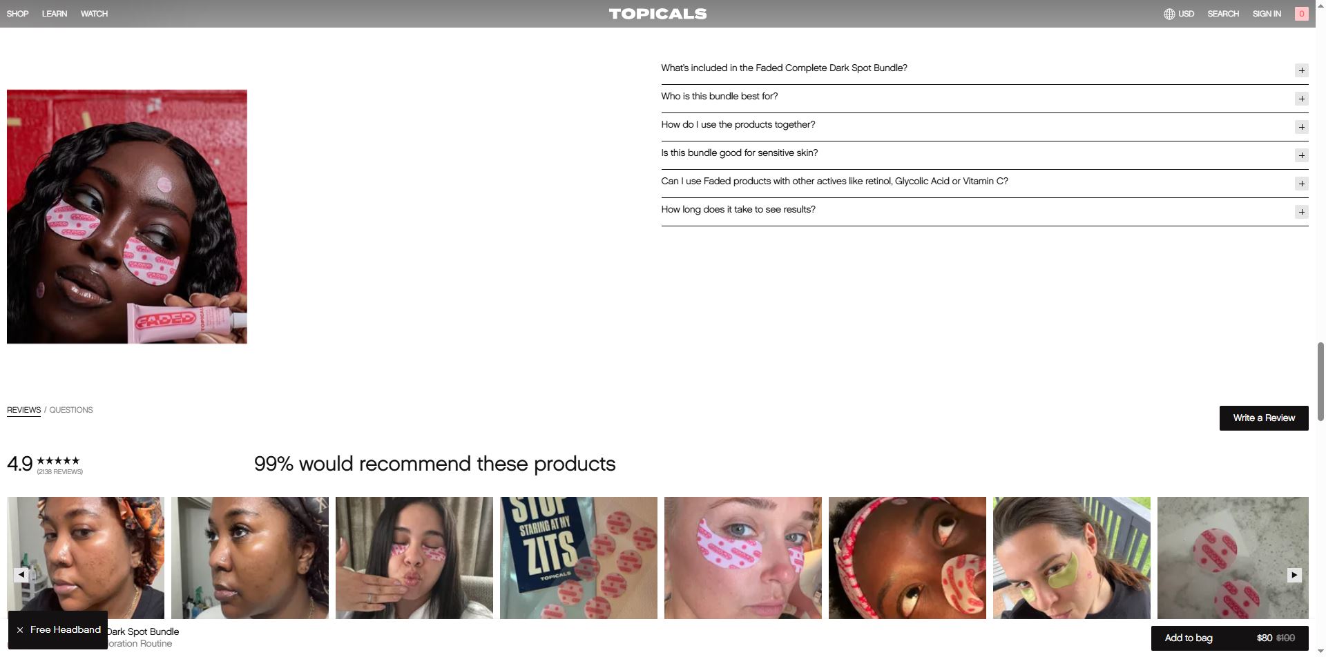
1. Social Proof
People follow others.
- Testimonials
- Reviews
- Case studies
2. Scarcity
Limited availability increases urgency.
- “Only 3 spots left”
- “Limited-time offer”
3. Authority
Users trust experts.
- Certifications
- Recognitions
- Professional branding
4. Reciprocity
Give value first.
- Free guides
- Useful content
These are not tricks. They are predictable human responses.
12. Why Most Websites Fail
Common reasons:
- Designed for aesthetics, not usability
- Ignoring user behavior data
- Overcomplicating navigation
- Lack of clear purpose
- No understanding of user intent
Root Cause
No psychological foundation.
13. Real-World Application: Turning Psychology Into Results
When user psychology is applied correctly:
- Bounce rates decrease
- Time on site increases
- Conversion rates improve
Example Flow
- Clear headline → reduces confusion
- Clean layout → lowers cognitive load
- Social proof → builds trust
- Strong CTA → guides action
This is not random. It’s engineered behavior.
14. Where Most Businesses Get It Wrong
They assume:
- “Good design = nice visuals”
- “Users will figure it out”
- “More features = better”
All three are incorrect.
Reality
- Design is communication
- Users don’t explore — they decide quickly
- Simplicity outperforms complexity
15. Introducing Professional Web Design Support
Understanding user psychology is one thing. Applying it correctly is another.
If you are building or redesigning a website and want it to actually perform — not just exist — you need a structured approach.
Lê Thành Nam Web Design Service focuses on:
- User-centered design
- Conversion optimization
- Clean, modern UI
- Performance-first development
What You Get
- Websites built based on real user behavior
- Clear structure and hierarchy
- Optimized for both desktop and mobile
- Designed to convert, not just display
Contact
- WhatsApp: +84949676736
Direct communication ensures faster execution and clarity.
Final Conclusion
Web design is not about trends, colors, or tools.
It is about understanding how people think.
Every effective website is built on:
- Reducing effort
- Building trust
- Guiding attention
- Supporting decision-making
Ignore psychology, and your website becomes decoration.
Use psychology, and it becomes a conversion system.
That is the difference between a website that exists and a website that works.