Picture this: you’re diving into a world of colors, creativity, and code, ready to build visually stunning websites that captivate users and deliver a smooth experience. As a designer, you might imagine that your job is all about aesthetics—choosing fonts, colors, and layouts that pop. But, suddenly, a question strikes: “Does web design require math?” Surprisingly, the answer is a delightful blend of yes and no. Although web design doesn’t demand calculus or advanced physics, math quietly powers some of the most crucial elements behind what makes a website look and feel intuitive. In this journey, we’ll uncover how math subtly, yet significantly, influences the art of web design, demystifying its role in a field that is often more than meets the eye.
The Silent Role of Math in Web Design
Math often gets a bad reputation, yet in web design, it exists more as a hidden helper than an intimidating obstacle. Concepts like proportions, ratios, and grid systems guide designers in creating layouts that balance beautifully on a page. One classic example is the “Golden Ratio,” a mathematical principle dating back to ancient Greece that still helps designers arrange elements in a way that’s pleasing to the human eye. When applied to web design, this ratio helps form layouts that are both visually harmonious and naturally engaging, guiding the viewer’s attention smoothly across the page.
Math also plays a central role in grid-based design systems. By dividing a web page into a set of columns and rows, a grid creates a structure that enhances visual consistency, readability, and flow. Designers calculate spacing, padding, and margins to ensure that each element feels organized, not chaotic, helping users navigate the content effortlessly. Without basic math skills, achieving this level of precision would be challenging, if not impossible.
Responsive Design and Percentages
Web design today must cater to a vast range of devices, from tiny smartphone screens to massive desktop monitors. To create layouts that adjust seamlessly across these devices, designers rely on percentages instead of fixed pixel values. Calculating dimensions in percentages may seem simple, but it’s a crucial skill to ensure that a design’s components remain proportional as screen sizes change. Here, basic arithmetic and fractions help designers maintain consistent layouts while keeping the user experience intact. It’s a practical, math-powered solution that transforms the same layout into a flexible, responsive one.
Typography and the Modular Scale
Typography, too, is influenced by mathematical principles. Choosing the right font size for headings, subheadings, and body text is more than just a matter of aesthetics. Designers often use a modular scale—a series of numbers that are mathematically proportional to each other—to create a visually harmonious hierarchy in text elements. By sticking to a consistent ratio, designers ensure that typography feels cohesive and balanced. This scaling relies on simple multiplication and division but makes a tremendous difference in readability and visual appeal.
CSS, Geometry, and Transformations
Creating animations and transformations in CSS often requires basic geometric knowledge. Think of rotating elements, scaling buttons, or creating hover effects—each of these effects relies on coordinate systems, angles, and percentages. Transformations require a grasp of trigonometry, even if at a basic level, to achieve the right movement, positioning, or scaling effect. Whether it’s rotating an image by 45 degrees or creating a 3D effect, math enables these interactions to feel smooth and engaging.
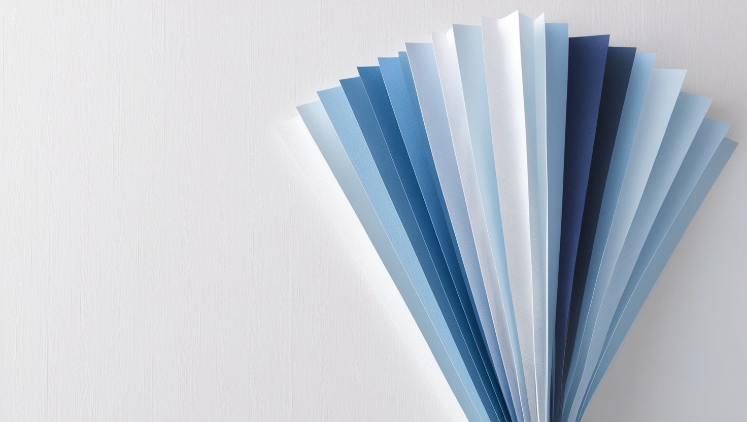
Color Theory and Math: The RGB and Hex Codes
Math is also embedded in color theory, which web designers use extensively. The RGB color model, for instance, is a system that blends red, green, and blue at varying intensities to produce millions of colors. Each color component in RGB ranges from 0 to 255, meaning designers often mix colors based on these values to find the perfect shade. The hexadecimal color system (or “hex code”) uses math in a similar way, with each hex code representing a combination of red, green, and blue intensities. Understanding how these colors interact is not only mathematical but helps designers craft a color palette that complements their design’s overall theme.
The Final Verdict: Math’s Subtle yet Essential Impact
So, does web design require math? While you may not need to solve calculus equations or derive integrals, math undeniably provides the foundational tools that keep web design precise, fluid, and user-friendly. Every subtle calculation—be it for responsive layouts, typography scaling, or color mixing—contributes to the seamless experience that users expect. Math isn’t the star of the show in web design, but it certainly deserves applause for its supporting role. In a field where the goal is to blend art with functionality, math provides the structure and balance that makes exceptional design possible.
Closing Thoughts
Web design without math is like a recipe missing key ingredients. You might not notice it at first, but eventually, you’ll sense something’s off. From pixel-perfect layouts to smooth animations, math is the quiet engine behind the visuals, turning creativity into practical results. Embracing math as a part of web design doesn’t mean giving up artistry; instead, it empowers designers to create experiences that look great and function even better. So, the next time you see a beautifully designed website, remember there’s a bit of math magic behind the scenes, working tirelessly to bring it all together.